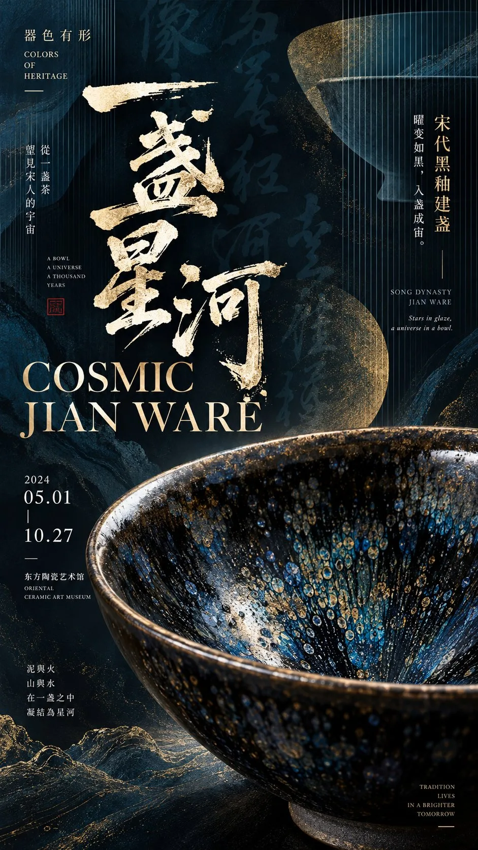
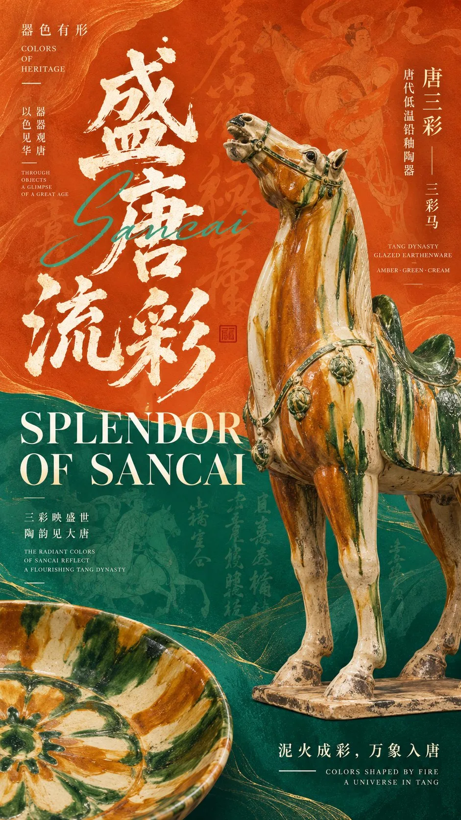
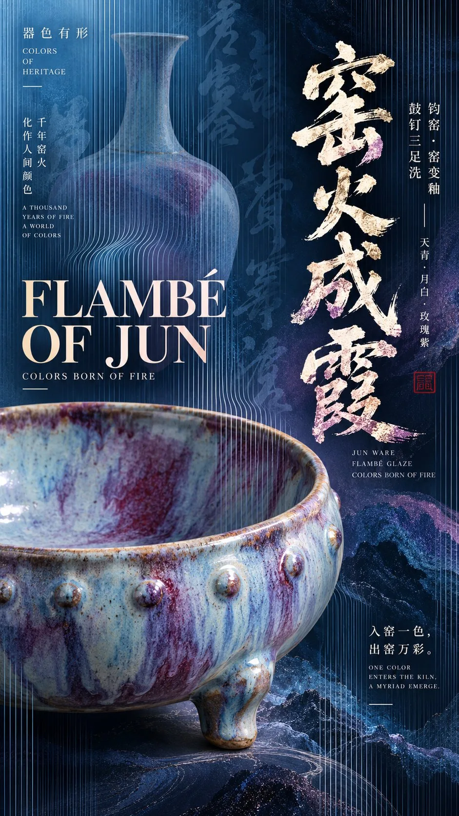
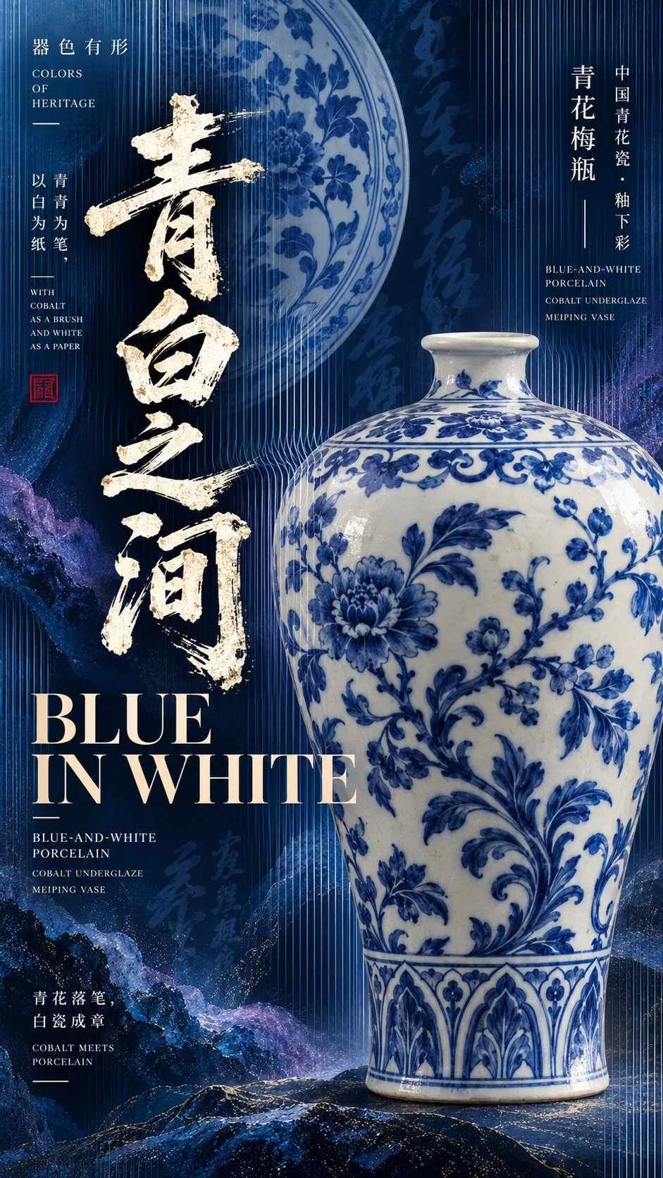
Chinese Ceramics and Calligraphy Posters

Large ceramic forms overlap brush calligraphy and uppercase serif titles, while mineral textures, contrasting color fields and fine optical stripes create depth. Replace the artifact, cultural theme, palette and titles while retaining the three visual anchors and a clear editorial information hierarchy.
Customize prompt
Original prompt
Simplified Chinese
【文化主题】:填写,如唐三彩、青花瓷、钧窑、建盏
【核心器物】:填写名称、器型及材质特征
【中文主标题】:填写
【英文主标题】:填写
【文化短句】:填写
【系列名称】:器色有形 / COLORS OF HERITAGE
【主色与辅助色】:填写
【视觉模式】:深色矿物 / 高饱和撞色 / 渐变光栅
【画幅比例】:9:16

创作一张高完成度的东方文博实验字体艺术海报,融合中国传统美学、博物馆展览视觉、复古编辑设计与现代实验 Typography。

一、器物与构图

以一件具有真实文化特征的器物作为核心主视觉,大比例展示,具备准确的器型、精致的材质纹理、自然釉面或表面质感,以及博物馆藏品摄影般的光影层次。

允许器物局部放大、边缘出框,与文字产生前后遮挡。加入一件局部裁切或半透明的辅助器物,利用大小、虚实、方向与形态差异建立空间层次。

二、字体与排版

中文主标题使用巨大而富有力量的毛笔书法,具有自然的笔锋、飞白与粗细变化,成为画面的重要视觉图形。

英文主标题采用高品质大写复古衬线字体,通过放大、分行、错位与叠压,与中文书法及器物产生互动。可加入少量优雅的英文连笔字作为辅助。

画面必须具有完整的编辑式信息层级,包括系列名称、器物名称、文化分类、工艺说明、中英文短句及少量精致标注线。信息密度中高,但保持明确的主次关系。

三、色彩与背景

根据选择的视觉模式设计:

- 深色矿物: 墨黑、深蓝、铜金等色彩,融合矿物纹理、局部金属色细节、半透明书法底纹,呈现深邃厚重的文化气质。
- 高饱和撞色: 使用两种鲜明的主色进行大面积分区,搭配有机曲线、器物错位出框、巨大字体与低对比文化纹样,形成复古编辑设计感。
- 渐变光栅: 使用具有空间深度的青蓝、靛紫等渐变色场,叠加连续细密的纵向光栅。线条在器物边缘产生轻微弯曲、疏密变化和前后遮挡,形成器物若隐若现的现代光学艺术效果。

背景融入与主题相关的传统书法、装饰纹样、釉色流动或历史文化肌理,透明度较低,丰富画面但不干扰主要信息。

四、视觉层级与完成度

以巨大中文书法、核心器物和英文大标题构建三个主要视觉锚点。

通过器物局部出框、文字叠压、色彩对比、背景虚影和精细线条,形成丰富的空间层次与阅读节奏。

远看具有强烈的视觉冲击和清晰的大形,近看能发现精致的材质、书法肌理、文化信息与图形细节。

整张海报应具有专业文博展览、艺术出版和文化品牌设计的完成度,成为一件具有独立主题表达的完整作品,而不是普通的器物展示模板。

确保器物造型准确、文字清晰、排版精密、色彩成熟。避免乱码、虚构展讯、无意义英文、廉价3D、过度科技特效、随机编号、四角星芒及水印。

最终输出一张9:16竖版高清艺术海报。
English
[Cultural Theme]: Fill in, e.g., Tang sancai, blue-and-white porcelain, Jun ware, Jian tea bowls
[Core Artifact]: Fill in the name, form, and material characteristics
[Chinese Main Title]: Fill in
[English Main Title]: Fill in
[Cultural Phrase]: Fill in
[Series Name]: 器色有形 / COLORS OF HERITAGE
[Primary and Secondary Colors]: Fill in
[Visual Mode]: Dark Mineral / Highly Saturated Contrasting Colors / Gradient Grating
[Aspect Ratio]: 9:16

Create a highly polished Eastern cultural heritage and museum art poster featuring experimental typography, combining traditional Chinese aesthetics, museum exhibition visuals, vintage editorial design, and modern experimental Typography.

I. Artifacts and Composition

Use one artifact with authentic cultural characteristics as the core visual, displayed at a large scale, with an accurate form, refined material textures, a natural glaze or surface texture, and layered light and shadow like museum collection photography.

Allow parts of the artifact to be enlarged and its edges to extend beyond the frame, with the artifact overlapping in front of and behind the text. Add one supporting artifact that is partially cropped or semi-transparent, using differences in size, tangible and ethereal appearance, orientation, and form to establish spatial layers.

II. Typography and Layout

Use enormous, powerful Chinese brush calligraphy for the Chinese main title, with natural brush-tip strokes, dry-brush white streaks, and variations in stroke thickness, making it an important visual graphic in the image.

Use a high-quality vintage serif typeface in uppercase for the English main title, interacting with the Chinese calligraphy and artifacts through enlargement, line breaks, offsetting, and overlap. A small amount of elegant English cursive lettering may be added as a supporting element.

The image must have a complete editorial information hierarchy, including the series name, artifact name, cultural classification, craftsmanship descriptions, short phrases in Chinese and English, and a few refined annotation lines. Information density should be medium to high, while maintaining a clear relationship between primary and secondary elements.

III. Colors and Background

Design according to the selected visual mode:

- Dark Mineral: Use colors such as ink black, deep blue, and copper-gold, combining mineral textures, localized metallic-color details, and semi-transparent calligraphic background patterns to convey a deep, weighty cultural character.
- Highly Saturated Contrasting Colors: Use two vivid main colors to divide large areas, accompanied by organic curves, artifacts offset beyond the frame, enormous typography, and low-contrast cultural motifs to create a vintage editorial design feel.
- Gradient Grating: Use gradient color fields such as cyan-blue and indigo-violet with spatial depth, overlaid with continuous, fine, closely spaced vertical gratings. The lines bend slightly at the edges of the artifact, vary in spacing, and overlap in front of and behind it, creating a modern optical-art effect in which the artifact is partially concealed and partially revealed.

Incorporate traditional calligraphy, decorative motifs, flowing glaze colors, or historical and cultural textures related to the theme into the background with low transparency, enriching the image without interfering with the main information.

IV. Visual Hierarchy and Finish

Build three main visual anchors with enormous Chinese calligraphy, the core artifact, and a large English title.

Create rich spatial layers and a reading rhythm through parts of the artifact extending beyond the frame, overlapping text, color contrasts, ghosted background imagery, and fine lines.

From a distance, the image should have a strong visual impact and clear overall forms; up close, viewers should discover refined materials, calligraphic textures, cultural information, and graphic details.

The entire poster should have the finish of professional cultural heritage and museum exhibitions, art publishing, and cultural brand design, becoming a complete work with its own thematic expression, rather than an ordinary artifact display template.

Ensure accurate artifact forms, clear text, precise layout, and mature use of color. Avoid garbled text, fabricated exhibition information, meaningless English, cheap-looking 3D, excessive technological effects, random numbering, four-pointed starbursts, and watermarks.

Finally, output one high-definition 9:16 vertical art poster.