
Customize: Sideways Travel Editorials
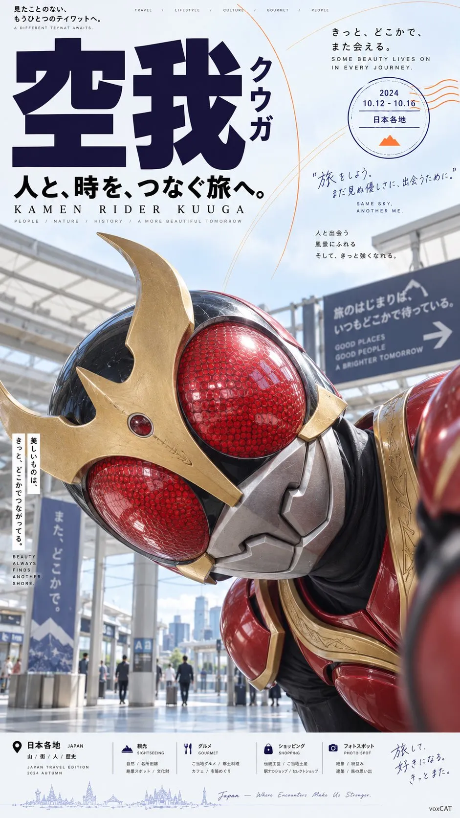
Prompt by @VoxcatAI. The image shows the original example.
Make it yours
Change the text fields below, or leave them blank to keep the original. They fill the highlighted parts of the prompt.
Reference images
Copy the prompt and attach your own reference images in your generation tool. Follow the requirements below and match any image labels to the prompt. No image upload is needed on UNIP.
Author’s instructions · English
[Character], preserve the character’s most essential identifying features, including face shape, hairstyle silhouette, hair color, eye color, signature accessories, clothing structure, representative colors, and temperament.
Design the character as a Japanese travel-magazine editorial poster with a slight internet-meme quality. Shoot the person at extremely close range, with the head tilted dramatically about 70–90° to one side, so the face is almost horizontal in the image and the head and face occupy roughly more than half of it. The upper body intrudes horizontally from the right or lower right; shoulders, hair, and body extend naturally out of frame, creating an unconventional pose of “entering the frame sideways.” Both eyes are clearly visible and look directly at the camera. The expression is natural and slightly confused, curious, or cool. Do not use a standard studio pose or an upright standing posture.
Use slightly wide-angle close-range perspective, with the face close to the lens and the features slightly enlarged by perspective, while keeping them natural and accurate. Create an obvious directional conflict between the subject and the vertical layout, producing the visual contrast of “the person’s pose is wrong, but the poster design is thoroughly professional.”
The background is a clean, ordinary, slightly lived-in modern space: light-blue tiles, glass, a wall, a hotel, a station, a travel setting, or a minimalist interior may be used. Do not create a cinematic scene. The photography overall resembles a casual phone shot or an ordinary consumer digital-camera snapshot, with natural, bright, clear, direct light. Do not use intense cinematic lighting or exaggerated shallow depth of field.
Use Japanese Travel Editorial × Lifestyle Magazine × Contemporary Asian Commercial Poster × Vernacular Meme Design for the layout. The overall structure is an asymmetric editorial grid: place enormous bold Chinese thematic characters at the upper left or left side, with vertical Japanese katakana beside them; use ample negative space and fine arcs / information bubbles at the upper right to arrange a date, location, and short description; place a small amount of mixed Chinese, Japanese, and English explanatory text, location names, kana pronunciation guides, and travel information around the person; establish a relatively orderly commercial-information strip at the bottom.
The typographic structure emphasizes the scale contrast between enormous Chinese characters and tiny editorial text, using heavy sans-serif, condensed sans-serif, vertical Japanese, and small supporting English information. The typography is professional, clean, restrained, and clearly hierarchical, while the person’s pose is deliberately absurd.
Base the colors on cool white, light gray, and blue-gray, with large areas of negative space; use dark purple and black as the main typographic anchors, and a small amount of orange fine lines, arcs, or information graphics as supporting accents.
Overall effect: a seemingly very proper Japanese travel magazine or commercial promotional poster, its order disrupted by a character tilting their head dramatically and entering sideways in extreme close-up. Formal Editorial design × Absurd subject × Deadpan humor × Internet Meme feel.
Only the highlighted parts change. Your edits stay on this page.